BY KIRELL BENZI
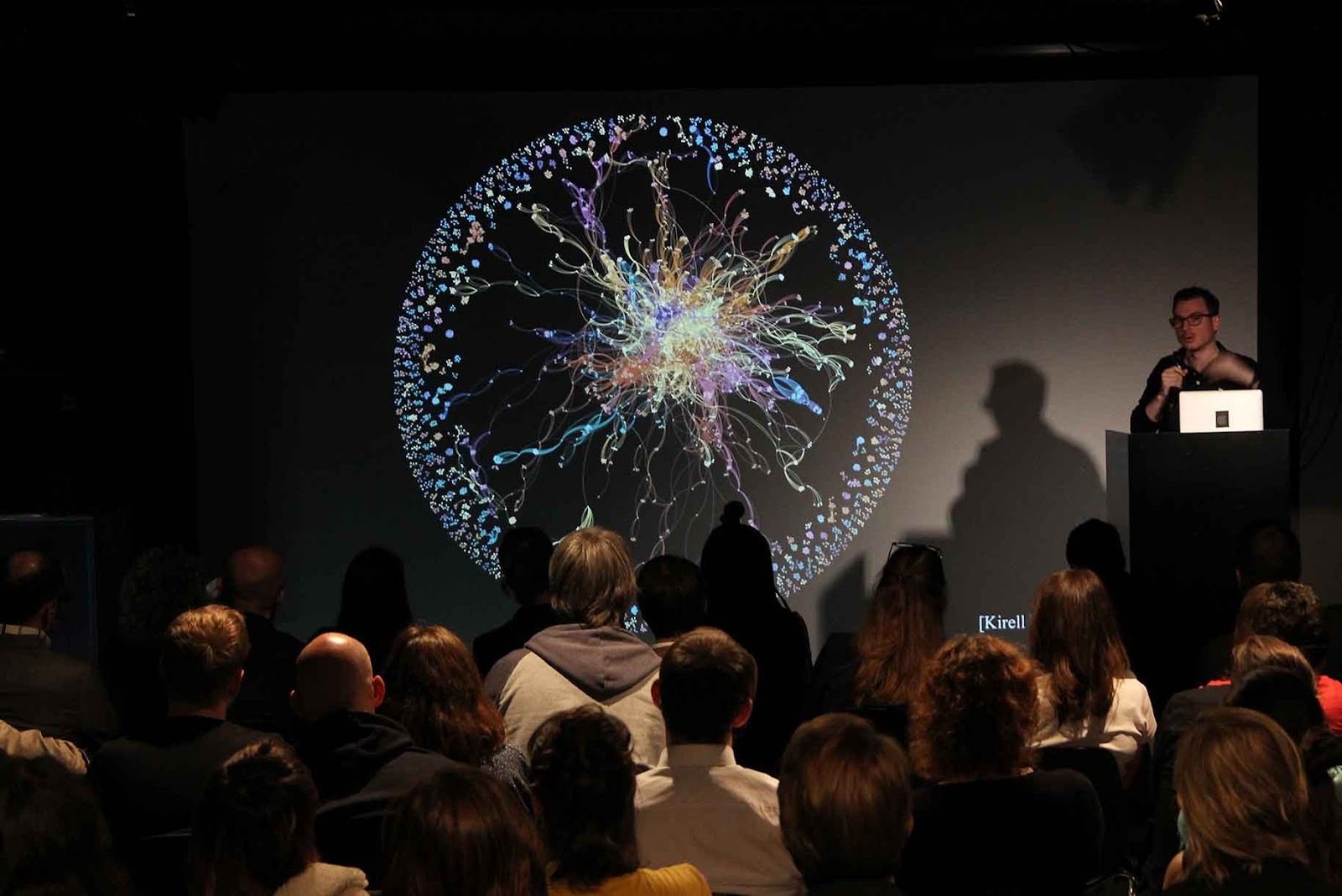
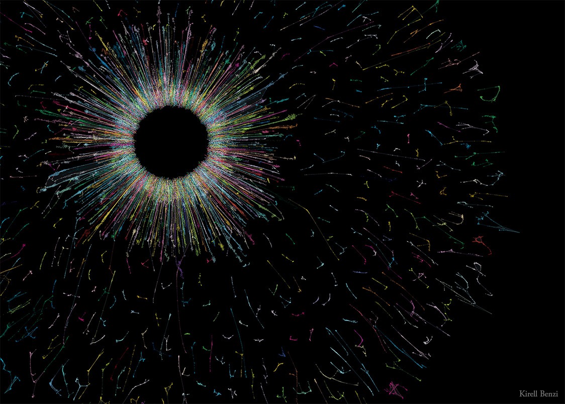
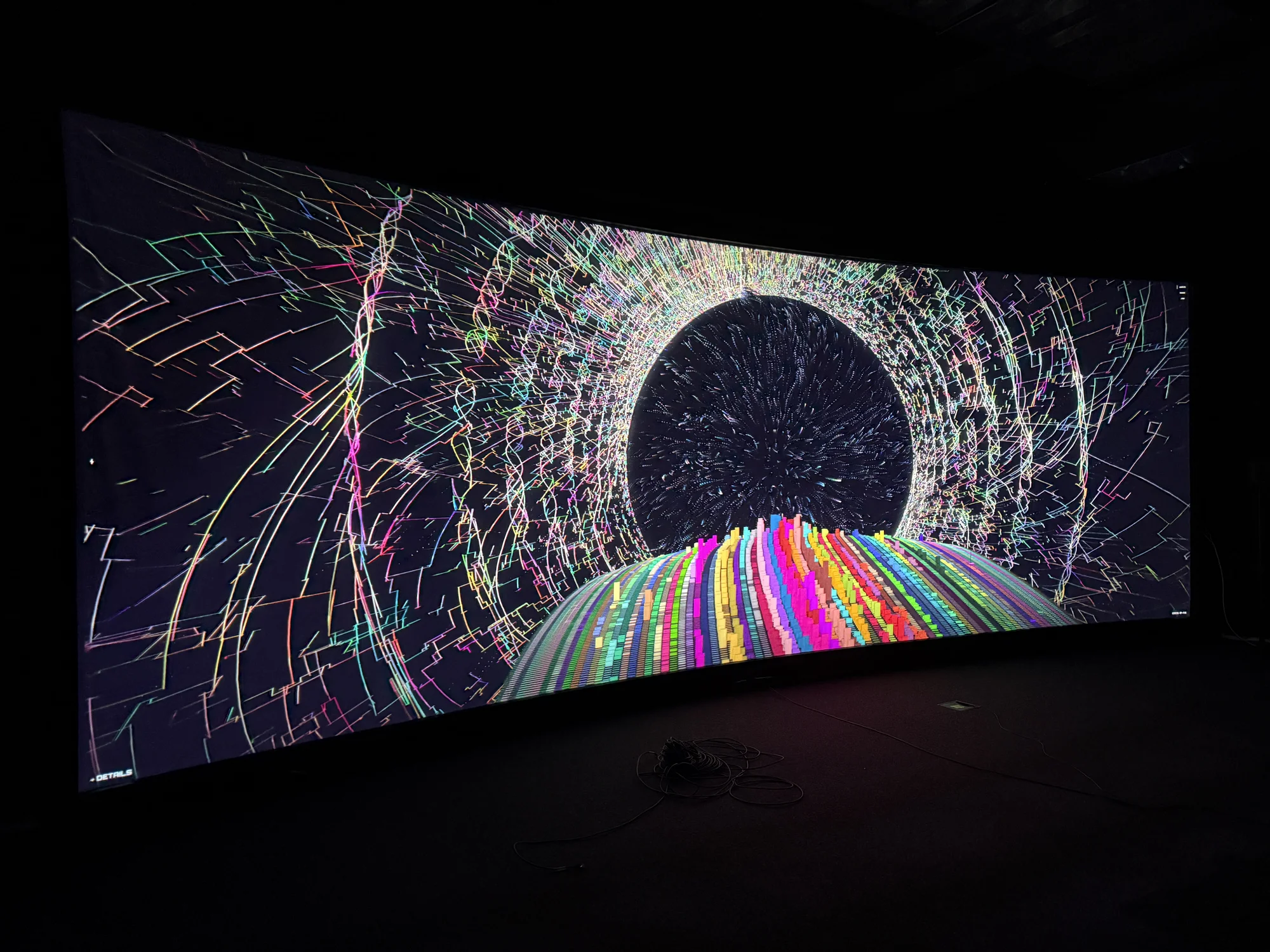
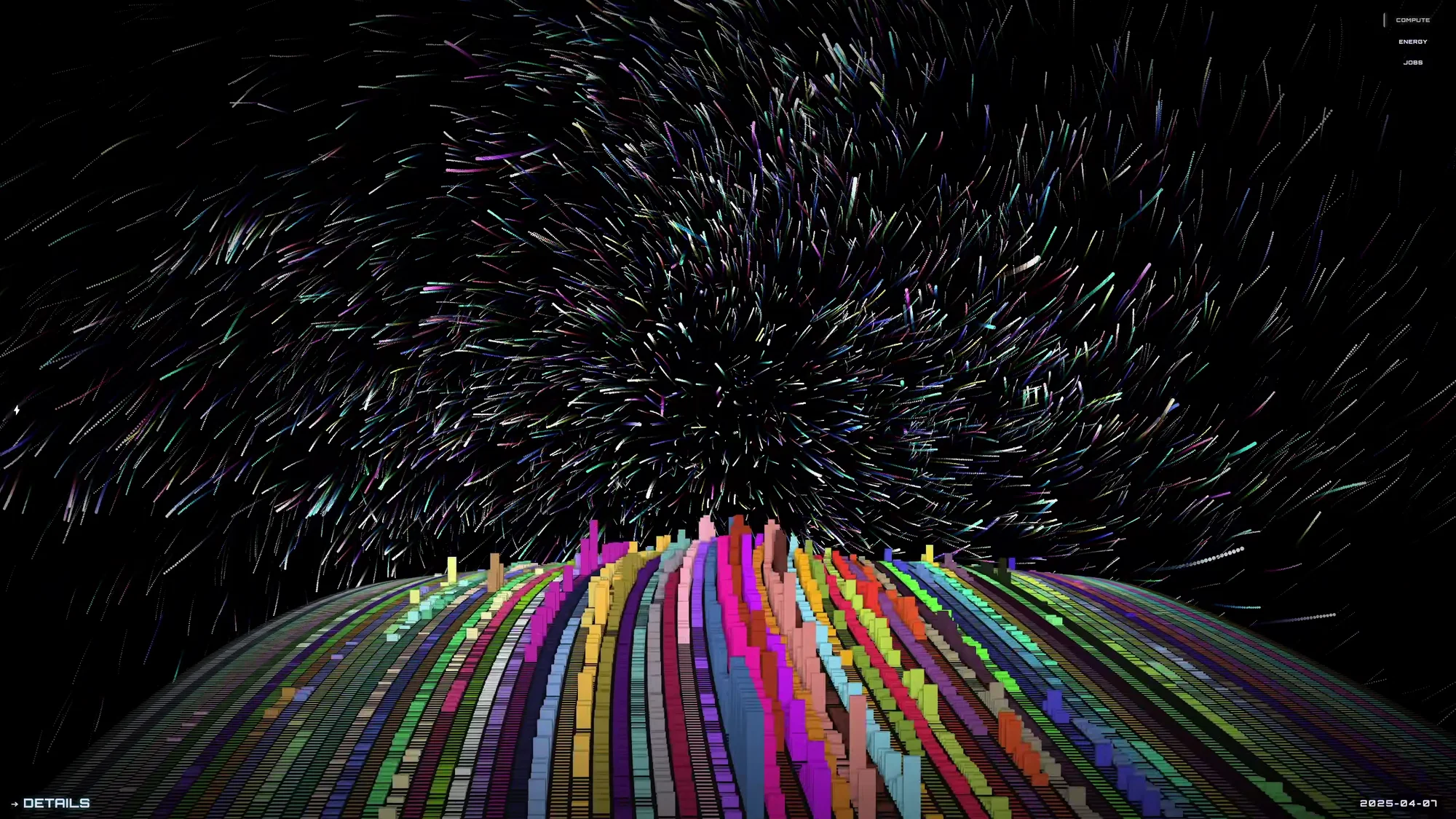
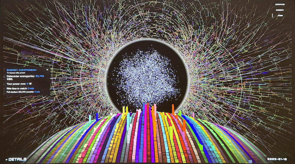
HPC Data Symphonies
An immersive data artwork translating the invisible labor of supercomputing into a living visual landscape.
What does it feel like to witness a supercomputer thinking?
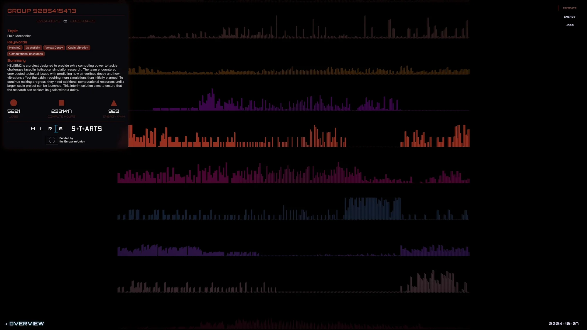
Every day, thousands of researchers send jobs to one of Europe's most powerful supercomputers at HLRS in Stuttgart. Climate models that run for weeks. Proteins folding in simulated time. Fluid dynamics. Astrophysics. Turbulence computed at scales we can't see with our eyes. It all happens silently. Rows of machines humming behind closed doors. Invisible.
This artwork makes that invisible labor visible. Not as numbers or dashboards, but as a living landscape with forms that grow, pulse, and shift with the rhythms of the machine.
The Human-Scale Translator
A connected bike sits at the center of the installation. You pedal. Your effort maps against the supercomputer's daily output. A minimal overlay shows the gap: how many years of continuous pedaling would equal today's computation? How many thousands of cyclists working together? Datacenters are hungry for energy. The bike makes that abstraction physical. You feel in your legs what it means to run a climate simulation. Numbers appear on screen, but the experience lives in your body. You understand scale before you read about it. What does it mean to consume this much energy, invisibly, continuously, in service of science?
Installation Modes
Interactive screen: Navigate through time and scientific domains with simple gestures. The piece responds, reveals structure as attention deepens.
Ambient mode: When idle, the visualization keeps evolving. A living backdrop.
LED installation: Data rhythms drive architectural lighting through Art-Net.
Bike integration: Physical effort connected to computational scale via Bluetooth.
Technical
- Python data pipeline running on HLRS infrastructure, processing millions of log entries into daily snapshots
- Real-time WebGL visualization built with cables.gl
- Custom GLSL shaders for procedural organic forms
- Adaptive rendering that scales from exhibition displays to laptops
Context
Developed during a year-long S+T+ARTS EC(H)O residency at HLRS Stuttgart in 2025. The European Commission funds S+T+ARTS to bring artists into scientific and technological institutions.
The challenge: translate supercomputer activity for public audiences without using dashboard language, without reducing computation to spectacle. The result sits between art and explanation. It invites contemplation rather than demanding comprehension.
Public presentation at HLRS theGATE festival, May 2026.
DATA
ART
MANIFESTO
Everything is data
We live in the age of data. Every day, 2.5 quintillion bytes (that’s 1 followed by 18 zeros!) of data are generated. And 90% of all the data in the world has been created these past two years.
If you find these numbers unfathomable, that’s perfectly normal. But consider this: everything you do produces data, whether it’s sending an email, ordering a sandwich, or taking the subway. Even the sea and its waves can generate interesting data!
What’s the use of all that data, once it’s been collected? Companies leverage it to make better business decisions; scientists analyze it to understand our world. While I use both approaches, my ambition is different: use data as a medium to create art.
From data viz to data art
Data visualization always starts with real-world data to create graphics that can be as simple as a bar chart and as complex as an interactive map.
For my Ph.D. thesis at the Ecole Polytechnique Fédérale de Lausanne (EPFL), I focused on network science and data visualization.
When I create a data artwork, I use the principles governing my scientific work. I start by shaping the data, using complex mathematical techniques such as machine learning. Falling under the umbrella of artificial intelligence, machine learning is a set of algorithmic methods that analyze large datasets for predictive or classification purposes. It can be used to scrape, sort and enrich data, and even to generate images. Then the creative process begins: what are the shapes and colors that fit the “message” within the data? How can I convey powerful emotions? That’s precisely where Data Art distinguishes itself from data visualization.
The result is indeed based on real data, rigorously analyzed and visible in the artwork, but the main objective of this project is to display the energy and community of this amazing music festival.This emotional technology is what fuels Data Art. Then again, Data Art is also different from Generative Art, a field that works with data to create pieces, but less focused on scientific accuracy. It’s all in the balance between soul and numbers!
Do algorithms have a soul?
Renaissance painters used egg white to link pigments on the canvas. In my artistic practice, data has replaced colors, but I still need a binding agent: the network. I want to bring it to life in the most expressive way possible. Put differently, data storytelling is at the heart of what I do.
The artwork “On Time” stems from the analysis of 42 million pedestrian positions in the Lausanne train station. Studying how users move in the station helps develop strategies to improve their commute. More specifically, if you have ever visited the station, your itinerary is probably mapped. From human to algorithm and back to human: we’ve come full circle.
Seeing, smiling, acting
As an avid web user, I’ve worked with data from Wikipedia and YouTube. I’ve even experienced the buzz effect of the Web by creating an artwork inspired by the Star Wars Universe, which was seen hundreds of thousands of times. If most of my creations can be found online, I am confident in their independent strength as evocative images.
I started to work with simple shapes and bright colors on a dark background. Some pieces may evoke a starry sky or a burning planet, yet they depict a complex universe that would be hard to grasp in its raw form.
As my data art practice matured, I started experimenting with other means of expression using code. You will now find several pieces made with neural networks as well as data fractals. Always inspired by nature, I try to find new ways to show that science is beautiful both to the eyes and to the mind.
HPC Data Symphonies
An immersive data artwork translating the invisible labor of supercomputing into a living visual landscape.
What does it feel like to witness a supercomputer thinking?
Every day, thousands of researchers send jobs to one of Europe's most powerful supercomputers at HLRS in Stuttgart. Climate models that run for weeks. Proteins folding in simulated time. Fluid dynamics. Astrophysics. Turbulence computed at scales we can't see with our eyes. It all happens silently. Rows of machines humming behind closed doors. Invisible.
This artwork makes that invisible labor visible. Not as numbers or dashboards, but as a living landscape with forms that grow, pulse, and shift with the rhythms of the machine.
The Human-Scale Translator
A connected bike sits at the center of the installation. You pedal. Your effort maps against the supercomputer's daily output. A minimal overlay shows the gap: how many years of continuous pedaling would equal today's computation? How many thousands of cyclists working together? Datacenters are hungry for energy. The bike makes that abstraction physical. You feel in your legs what it means to run a climate simulation. Numbers appear on screen, but the experience lives in your body. You understand scale before you read about it. What does it mean to consume this much energy, invisibly, continuously, in service of science?
Installation Modes
Interactive screen: Navigate through time and scientific domains with simple gestures. The piece responds, reveals structure as attention deepens.
Ambient mode: When idle, the visualization keeps evolving. A living backdrop.
LED installation: Data rhythms drive architectural lighting through Art-Net.
Bike integration: Physical effort connected to computational scale via Bluetooth.
Technical
- Python data pipeline running on HLRS infrastructure, processing millions of log entries into daily snapshots
- Real-time WebGL visualization built with cables.gl
- Custom GLSL shaders for procedural organic forms
- Adaptive rendering that scales from exhibition displays to laptops
Context
Developed during a year-long S+T+ARTS EC(H)O residency at HLRS Stuttgart in 2025. The European Commission funds S+T+ARTS to bring artists into scientific and technological institutions.
The challenge: translate supercomputer activity for public audiences without using dashboard language, without reducing computation to spectacle. The result sits between art and explanation. It invites contemplation rather than demanding comprehension.
Public presentation at HLRS theGATE festival, May 2026.
DATA
ART
MANIFESTO
Everything is data
We live in the age of data. Every day, 2.5 quintillion bytes (that’s 1 followed by 18 zeros!) of data are generated. And 90% of all the data in the world has been created these past two years.
If you find these numbers unfathomable, that’s perfectly normal. But consider this: everything you do produces data, whether it’s sending an email, ordering a sandwich, or taking the subway. Even the sea and its waves can generate interesting data!
What’s the use of all that data, once it’s been collected? Companies leverage it to make better business decisions; scientists analyze it to understand our world. While I use both approaches, my ambition is different: use data as a medium to create art.
From data viz to data art
Data visualization always starts with real-world data to create graphics that can be as simple as a bar chart and as complex as an interactive map.
For my Ph.D. thesis at the Ecole Polytechnique Fédérale de Lausanne (EPFL), I focused on network science and data visualization.
When I create a data artwork, I use the principles governing my scientific work. I start by shaping the data, using complex mathematical techniques such as machine learning. Falling under the umbrella of artificial intelligence, machine learning is a set of algorithmic methods that analyze large datasets for predictive or classification purposes. It can be used to scrape, sort and enrich data, and even to generate images. Then the creative process begins: what are the shapes and colors that fit the “message” within the data? How can I convey powerful emotions? That’s precisely where Data Art distinguishes itself from data visualization.
The result is indeed based on real data, rigorously analyzed and visible in the artwork, but the main objective of this project is to display the energy and community of this amazing music festival.This emotional technology is what fuels Data Art. Then again, Data Art is also different from Generative Art, a field that works with data to create pieces, but less focused on scientific accuracy. It’s all in the balance between soul and numbers!
Do algorithms have a soul?
Renaissance painters used egg white to link pigments on the canvas. In my artistic practice, data has replaced colors, but I still need a binding agent: the network. I want to bring it to life in the most expressive way possible. Put differently, data storytelling is at the heart of what I do.
The artwork “On Time” stems from the analysis of 42 million pedestrian positions in the Lausanne train station. Studying how users move in the station helps develop strategies to improve their commute. More specifically, if you have ever visited the station, your itinerary is probably mapped. From human to algorithm and back to human: we’ve come full circle.
Seeing, smiling, acting
As an avid web user, I’ve worked with data from Wikipedia and YouTube. I’ve even experienced the buzz effect of the Web by creating an artwork inspired by the Star Wars Universe, which was seen hundreds of thousands of times. If most of my creations can be found online, I am confident in their independent strength as evocative images.
I started to work with simple shapes and bright colors on a dark background. Some pieces may evoke a starry sky or a burning planet, yet they depict a complex universe that would be hard to grasp in its raw form.
As my data art practice matured, I started experimenting with other means of expression using code. You will now find several pieces made with neural networks as well as data fractals. Always inspired by nature, I try to find new ways to show that science is beautiful both to the eyes and to the mind.
Dr. Kirell Benzi is an award-winning data visualization artist, TEDx speaker and data science researcher. His unique work, mixing data science, machine learning and abstract aesthetics, has been shown in museums, newspapers, magazines and on over 100 websites in 10 languages. He regularly tours the world to inspire people by showing the positive outcomes of technology for our society using visualization. In 2024, he founded the decode.gl platform to share and teach the secrets behind his works.

BY KIRELL BENZI
HPC Data Symphonies
An immersive data artwork translating the invisible labor of supercomputing into a living visual landscape.
What does it feel like to witness a supercomputer thinking?
Every day, thousands of researchers send jobs to one of Europe's most powerful supercomputers at HLRS in Stuttgart. Climate models that run for weeks. Proteins folding in simulated time. Fluid dynamics. Astrophysics. Turbulence computed at scales we can't see with our eyes. It all happens silently. Rows of machines humming behind closed doors. Invisible.
This artwork makes that invisible labor visible. Not as numbers or dashboards, but as a living landscape with forms that grow, pulse, and shift with the rhythms of the machine.
The Human-Scale Translator
A connected bike sits at the center of the installation. You pedal. Your effort maps against the supercomputer's daily output. A minimal overlay shows the gap: how many years of continuous pedaling would equal today's computation? How many thousands of cyclists working together? Datacenters are hungry for energy. The bike makes that abstraction physical. You feel in your legs what it means to run a climate simulation. Numbers appear on screen, but the experience lives in your body. You understand scale before you read about it. What does it mean to consume this much energy, invisibly, continuously, in service of science?
Installation Modes
Interactive screen: Navigate through time and scientific domains with simple gestures. The piece responds, reveals structure as attention deepens.
Ambient mode: When idle, the visualization keeps evolving. A living backdrop.
LED installation: Data rhythms drive architectural lighting through Art-Net.
Bike integration: Physical effort connected to computational scale via Bluetooth.
Technical
- Python data pipeline running on HLRS infrastructure, processing millions of log entries into daily snapshots
- Real-time WebGL visualization built with cables.gl
- Custom GLSL shaders for procedural organic forms
- Adaptive rendering that scales from exhibition displays to laptops
Context
Developed during a year-long S+T+ARTS EC(H)O residency at HLRS Stuttgart in 2025. The European Commission funds S+T+ARTS to bring artists into scientific and technological institutions.
The challenge: translate supercomputer activity for public audiences without using dashboard language, without reducing computation to spectacle. The result sits between art and explanation. It invites contemplation rather than demanding comprehension.
Public presentation at HLRS theGATE festival, May 2026.
DATA
ART
MANIFESTO
Everything is data
We live in the age of data. Every day, 2.5 quintillion bytes (that’s 1 followed by 18 zeros!) of data are generated. And 90% of all the data in the world has been created these past two years.
If you find these numbers unfathomable, that’s perfectly normal. But consider this: everything you do produces data, whether it’s sending an email, ordering a sandwich, or taking the subway. Even the sea and its waves can generate interesting data!
What’s the use of all that data, once it’s been collected? Companies leverage it to make better business decisions; scientists analyze it to understand our world. While I use both approaches, my ambition is different: use data as a medium to create art.
From data viz to data art
Data visualization always starts with real-world data to create graphics that can be as simple as a bar chart and as complex as an interactive map.
For my Ph.D. thesis at the Ecole Polytechnique Fédérale de Lausanne (EPFL), I focused on network science and data visualization.
When I create a data artwork, I use the principles governing my scientific work. I start by shaping the data, using complex mathematical techniques such as machine learning. Falling under the umbrella of artificial intelligence, machine learning is a set of algorithmic methods that analyze large datasets for predictive or classification purposes. It can be used to scrape, sort and enrich data, and even to generate images. Then the creative process begins: what are the shapes and colors that fit the “message” within the data? How can I convey powerful emotions? That’s precisely where Data Art distinguishes itself from data visualization.
The result is indeed based on real data, rigorously analyzed and visible in the artwork, but the main objective of this project is to display the energy and community of this amazing music festival.This emotional technology is what fuels Data Art. Then again, Data Art is also different from Generative Art, a field that works with data to create pieces, but less focused on scientific accuracy. It’s all in the balance between soul and numbers!
Do algorithms have a soul?
Renaissance painters used egg white to link pigments on the canvas. In my artistic practice, data has replaced colors, but I still need a binding agent: the network. I want to bring it to life in the most expressive way possible. Put differently, data storytelling is at the heart of what I do.
The artwork “On Time” stems from the analysis of 42 million pedestrian positions in the Lausanne train station. Studying how users move in the station helps develop strategies to improve their commute. More specifically, if you have ever visited the station, your itinerary is probably mapped. From human to algorithm and back to human: we’ve come full circle.
Seeing, smiling, acting
As an avid web user, I’ve worked with data from Wikipedia and YouTube. I’ve even experienced the buzz effect of the Web by creating an artwork inspired by the Star Wars Universe, which was seen hundreds of thousands of times. If most of my creations can be found online, I am confident in their independent strength as evocative images.
I started to work with simple shapes and bright colors on a dark background. Some pieces may evoke a starry sky or a burning planet, yet they depict a complex universe that would be hard to grasp in its raw form.
As my data art practice matured, I started experimenting with other means of expression using code. You will now find several pieces made with neural networks as well as data fractals. Always inspired by nature, I try to find new ways to show that science is beautiful both to the eyes and to the mind.
Dr. Kirell Benzi is an award-winning data visualization artist, TEDx speaker and data science researcher. His unique work, mixing data science, machine learning and abstract aesthetics, has been shown in museums, newspapers, magazines and on over 100 websites in 10 languages. He regularly tours the world to inspire people by showing the positive outcomes of technology for our society using visualization. In 2024, he founded the decode.gl platform to share and teach the secrets behind his works.